In this post we will discuss how squared effect sizes such as \(\eta^2\) and \(R^2\) are distributed and the implications of this when conducting a meta-analysis
Author
Matthew B. Jané
Published
November 6, 2023
Defining a Squared Effect Size
Sometimes squared effect sizes are used in order to interpret results (e.g., \(R^2\), \(\eta^2\)). However these squared indices are biased in small sample sizes. To see why this is the case we can describe the mathematically. Generally, lets say we have some observed effect size \(h_i\) for a sample \(i\). This can be modeled as a function of a population correlation \(\theta\) and sampling error \(e_i\),
\[
h_i = \theta + e_i
\]
Where the expectation of \(h_i\) (i.e., the average) upon repeated sampling is equal to \(\theta\). More importantly for us, the expectation of sampling error \(e_i\) across repeated samples would be zero. For the expectation of \(e_i\) to be zero, \(e\) would need to be randomly distributed around zero with both positive and negative values. Let us see what happens to the model once we square both sides to obtain \(h^2\):
\[
h^2_i = (\theta + e_i)^2
\]
and thus,
\[
h^2_i = \theta^2 + 2\theta e_i + e_i^2
\]
The squared effect sizes is now no longer an unbiased estimate of theta. The bias in \(h_i^2\) can be seen by taking the expected value of both sides (note that the \(\text{Var}(e_i)\) is the sampling error variance and \(\mathbb{E}[\cdot]\) is the expected value or the mean across repeated samples):
Since the sampling error variance is always positive (unless the sample size was infinite…), there will be a positive bias in expected value of \(h_i^2\). It is important to note that the variance in sampling error (i.e., \(\text{Var}(e_i)\)) will be larger with smaller sample sizes.
Simulated Example
Lets assume that in the population, the squared correlation between predicted and observed outcome (\(R^2\)) is zero, that is, the independent variables (\(X_1\),\(X_2\), and \(X_3\)) do not explain any variance in the dependent variable (\(Y\)). Lets simulate two studies, where one study has a sample size of 100 and the other has a sample size of 25. Then lets replicate these studies 5,000 times. In the first figure we will see that the mean value of \(R^2\) is not zero even though the population value is. And with the smaller sample sizes within each study (\(N = 25\)), the mean \(R^2\) is larger. The plots below show the distribution of \(R^2\) using the ggdist package (kay?).
If we were to run a meta-analysis on all 5,000 studies and found a meta-analytic average \(R^2\) of .13, we may conclude that there is a meaningful prediction/effect, however, this could simply be an artifact of sampling error. The plot below shows how the mean \(R^2\) changes as you vary the sample size.
Code
set.seed(343)# sample sizeN <-100R2 <- N <-c()for(i in1:5000){ N[i] <-runif(1,10,70)# Obtain simulated scores x1 <-rnorm(N[i] ,0,1) x2 <-rnorm(N[i] ,0,1) x3 <-rnorm(N[i] ,0,1) y <-rnorm(N[i] ,0,1)# linear regression model mdl <-lm(y ~ x1) R2[i] <-summary(mdl)$r.squared}ggplot(data=NULL, aes(N,R2)) +theme_barbie(barbie_font =FALSE) +stat_smooth( color = barbie_theme_colors['dark']) +theme(aspect.ratio =1, panel.background =element_rect(fill ='#f1f9fa',color ='#f1f9fa'),plot.background =element_rect(fill ='#f1f9fa',color ='#f1f9fa'), )+labs(y =TeX("Mean $R^2$"),x="Sample Size", title ="")+expand_limits(y =0)## `geom_smooth()` using method = 'gam' and formula = 'y ~ s(x, bs = "cs")'
Conclusion
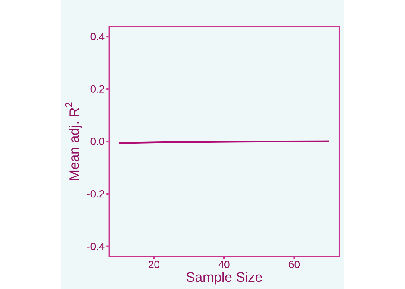
In a meta-analysis, it is always best to use directional effect sizes that can be both positive and negative such as Cohen’s \(d\)’s or Pearson correlations. There are other strategies for meta-analyzing \(R^2\) values such as using individual person data meta-analysis (using the raw data for each study) or meta-analyzing the correlation matrix between predictors and outcomes first and then running the regression model on the meta-analytic correlation matrix (this would not allow for non-linear terms though). If it is necessary to meta-analyze \(R^2\) you will want to use the adjusted \(R^2\) value. See the plot below that shows the adjusted \(R^2\) across different sample sizes
Code
set.seed(343)# sample sizeN <-100R2 <- N <-c()for(i in1:5000){ N[i] <-runif(1,10,70)# Obtain simulated scores x1 <-rnorm(N[i] ,0,1) x2 <-rnorm(N[i] ,0,1) x3 <-rnorm(N[i] ,0,1) y <-rnorm(N[i] ,0,1)# linear regression model mdl <-lm(y ~ x1) R2[i] <-summary(mdl)$adj.r.squared}ggplot(data=NULL, aes(N,R2)) +theme_barbie(barbie_font =FALSE) +stat_smooth( color = barbie_theme_colors['dark']) +theme(aspect.ratio =1, panel.background =element_rect(fill ='#f1f9fa',color ='#f1f9fa'),plot.background =element_rect(fill ='#f1f9fa',color ='#f1f9fa'), )+labs(y =TeX("Mean adj. $R^2$"),x="Sample Size", title ="")+ylim(c(-.4,.4)) +expand_limits(y =0)## `geom_smooth()` using method = 'gam' and formula = 'y ~ s(x, bs = "cs")'